How we started
We are humbled to have the ability to deliver care management services to millions of community health center patients through the power of telehealth, but it wasn’t always that way. Certintell was founded in 2014 with the mission to help underserved populations receive health care, and we accomplished this mission with the launch of our telehealth platform. This platform has progressed leaps and bounds by covering all modalities of telehealth and we expanded our offerings to include care management services. As our brand offerings grew, we wanted our brand identity to grow with it. We rejoice and reflect this growth with an addition to our brand identity — this is the process we took and the finished product.
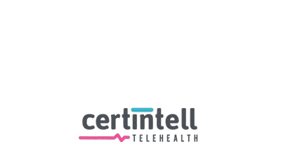
Where we’re at
As you are familiar with our current and primary logo, we thought we’d point out a couple of key themes of our logo details:
![]()
DETAILS
TWO COLORS: We incorporated two distinct colors (waterfall and cherry), which represent our two audiences—patients and health providers.
VITAL SYMBOL: Next to the word “telehealth” we have the symbol representing vitals and thus vitality, full of life and energy.
Evolving into more
VITALITY
We started with a concept of vitality and framed this into an icon (below). However, with the power of telehealth, community health centers can now reach patients beyond the four walls of clinics so we needed to go beyond a framed icon.

SHARING
With the advent of social media and mobile devices, the ease at which information can be shared is synonymous with daily life. This universal symbol represents the sharing of concepts, opinions, ideas and even health information through Store-and-Forward techniques:

By combining the best of both of these concepts, we crafted the perfect addition to our brand identity. The new icon and secondary logo represent how telehealth can integrate within community health center workflows and how care management needs to be a shared program between the whole care team—here is the addition to our brand identity:
LOGO
|
ICON
|
DETAILSTWO-COLORED SHAPE: The two colors complete each other to create a more uniform shape, which represents the shared responsibility of care for health providers and patients alike.
ARROW SYMBOL: The sharing of information is crucial for delivering patient-centered care. The top-right corner represents the universal sharing icon.
ROOM SYMBOL: Providing health services outside the “Four Walls” of health centers has always been at the core of telehealth usage. The universal sharing icon represents this by taking over a corner of the room.
OPENING SYMBOL: Making health care available to underserved populations, including those negatively affected by social determinants of health (SDOH), is at the core of our mission. We represent “expanding access to care” by not connecting the ‘arrow’ and ‘share’ symbols signifying inclusiveness and the ability to reach patients outside the walls of the health center.
Access for all
We will conclude with an interactive representation showing the flux of health care and technology fusing as one in order to improve access to care, aligning with our mission: CLOSING THE CARE GAP.